What is Empathetic Design?
There are several types of design processes out there. There is user-centered design, iterative design, immersive design, emergent design, and the list goes on. There is one specific design process, however, that has gained traction in recent years—empathetic design. As more consumers are looking for their devices, tools, and other products to really work for them and improve their livelihoods, companies have begun to adopt this human-centered design process for product design and industrial design. What exactly is empathetic design, though? Empathetic design is the process of design that involves user research and focuses more on the person rather than technology. Through empathetic design, you create solutions that address real human needs.
Empathic Design vs. Empathetic Design
There is some confusion regarding the difference between “empathic” design and “empathetic” design. As noted in an essay published in 2007, empathic design is a concept defined by Rayport and Leonard-Barton. In empathic design, the designer assesses the users’ potential needs by assuming the need. For example, if there is data stating that an old post office does not have accessibility for the handicap, an architect will build an entrance with a ramp for the new building. There is no firsthand research being done in empathic design. In empathetic design, however, there is. The designer will typically put themselves in the shoes of the user. For example, a designer may use a cane for a day to see how the mobility accessory can be improved for the elderly and disabled.
Empathetic Design for Products
Empathetic product design has been widely implemented by several firms and teams. And, there are a few different approaches to this process. The first approach is to put oneself in the shoes of the user. This may involve spending an extended amount of time doing a specific activity or using a tool. The second approach is to simply observe people using an object. This might be done through a focus group, so you can get direct testimony from your users.
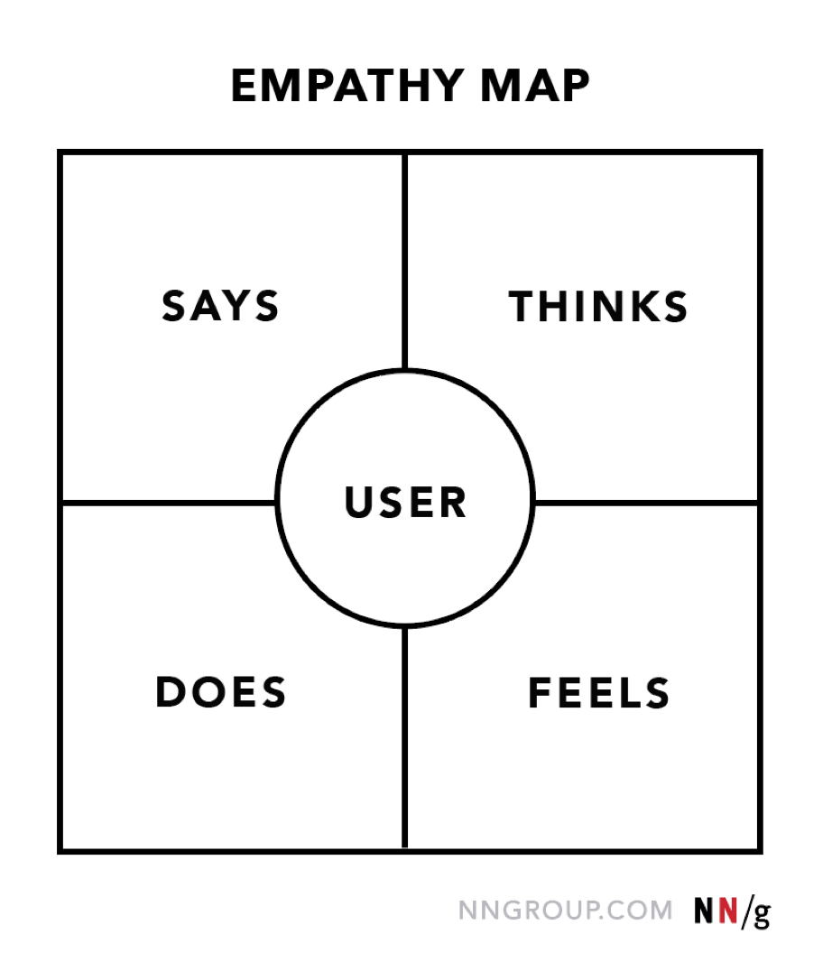
One technique that is used in empathetic product design is empathy mapping. Empathy mapping is a visual presentation that contains information regarding a user’s behavior. It not only helps a designer better understand their user, but also helps them to see things more clearly from the perspective of the user—and in turn, create better solutions. Shown below is an example of an empathy map.
Why It’s Essential
Empathy in industrial design and product design is essential to design thinking. For one, it allows you to think like a consumer and make products that best serve your customers. Without empathy in design, products lack depth, and the user experience lacks a human-centered aspect.
According to the Interaction Design Foundation, when you bring more empathy into the product design process, part of your job is to absorb not just what consumers say—but what they mean. Have intuition. Lean in. That is how you truly discover what your customer needs.
It’s not to say you still won’t run into design challenges along the way, either. This is a natural part of the design process. You may think you got your consumer right, but later realize that you got it all wrong. This is where empathetic design may need to be paired with another form of design thinking, such as iterative design. With iterative design, you can test out several different versions of a product to make absolute certain you have it right. This leaves even less room for error and miscommunication between user and designer.
How Loomia Has Implemented
During the pandemic, Loomia embarked on a design project that is a perfect example of empathetic design thinking. We knew that smaller makers and creative technologists wanted to utilize our Loomia Electronic Layer technology in their prototypes, but our core unit was too large compared to the size of projects they typically work on. We developed a 10-piece collection of prototyping parts that are embedded with our e-textile technology, but are smaller in size to accommodate smaller scale projects.
A common issue many makers face, and we ourselves have faced when working with e-textile components, is integration. The means in which most e-textile components are integrated into materials or surfaces is limited, with most requiring a needle and thread. We saw this as a hurdle, so every part comes with a 3M sticky backing—allowing the part to adhere to any surface area.
Another problem we saw with most e-textile components on the market is that they cannot be soldered together. We changed this by adding headers to each part, meaning that every part in our collection can be combined to create more power and a unique geometry. Because we at Loomia are also engineers and technologists, we are uniquely qualified to gauge what our customers want. Thus, we have been able to develop a range of products that address the needs of the average user we sell to.
WANT MORE? CHECK OUT THESE ARTICLES ON DESIGN!
Electronic Textiles: An Ingredient for Impactful Innovation

